by Lisa Zeiger
“I dream of a new alphabet.” — Marcel Broodthaers, 1974
When considering the merit of a work of art, should the biography of its maker matter? Should we train the tentacles of personality upon the armature of art? When I first saw images of David D. Oquendo’s calligraphic paintings on Instagram (@monkpuppy) I had no ideas about the age, identity or ethnicity of their maker. The paintings were all sign rather than signature, solemn instances of regal yet anonymous beauty, not unlike that of many hieroglyphic writings made in ancient Egypt. Such was the imposing presence of these unfamiliar letters that, while I wondered if they conveyed a meaning, I didn’t care. As I would later learn, a friend of Oquendo’s told him, “You have not created a language, but language.”

I was moved to know more about the maker of these forms because of the precision, stature, and beauty this artist brought to the practice of writing on a wall. Their creator had spawned an autonomous system of symbols which conceivably could be reproduced and recombined to make fresh meanings, should they be carried out into the world by other hands: by subsequent writers, graphic designers, and printers eager to lend the intrigue and eloquence of Oquendo’s ciphers to a meaningful text, whether shop sign or novel.
Alphabets and the typefaces which represent them often wander without author, unless their reader, designer or other consumer is an initiate of the graphic arts. Then the typeface we find on so many shopfronts and advertisements in England, for example, takes on an identity: we come to know it as Gill Sans, named after the artist-typographer Eric Gill, who invented the font in 1928. I don’t know whether Oquendo will become a font, but certainly it could function as one, with power and seriousness. Helvetica is one of Oquendo’s own favorite fonts–I myself can’t remember its designer–but he is ambivalent about its ubiquity: “I like it because it is legible, but it’s so overused, it has become invisible.”
In fact, the evolution of Oquendo’s letter forms is a curious tale of drawing before writing, and of a second language, English, supplanting his mother tongue, Spanish, torn away from him by ESL teachers at an early age. Born in Puerto Rico, he emigrated to the U.S. with his parents at two, learning English at the cost of forgetting Spanish. Much later, in graduate school, he would resolve to draw and paint, as he had done, beginning as a small child, rather than pursue photography. Having just enough money for a studio, with nothing to spare for canvases, Oquendo began simply painting on his walls and photographing the result, before painting over it with new images. He was deeply influenced at that time by Werner Herzog’s 2010 documentary Cave of Forgotten Dreams, about the 32,000-year-old figurative wall paintings inside the Chauvet Cave in southern France, discovered in 1994. Oquendo’s first wall paintings were not of letter forms, but of pictorial forms and symbols he invented. “I decided to create symbols inspired by cartoons: Monkpuppy; and Boomer, half-Mickey Mouse, half-mushroom.
“The bridge between figurative and letter forms was the Prayer Bead series,” says Oquendo. “Different cultures use various objects in worship: Buddhist beads, Greek worry beads, Catholic rosaries, and knots in some Jewish sects. At first, I painted illusionistic spherical forms, but the more I painted, the more it became about the brushwork.”
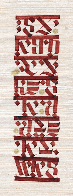
As an undergraduate at Rutgers, Oquendo had taken many courses in graphic design and typography, which he disliked at the time but which taught him more concrete skills than he later acquired from his fine art studies. With his calligraphy pens and pencils he started copying Hebrew, Arabic and Black Letter.
“I realized I don’t like copying, I want to create. A friend encouraged me to write my own alphabet: ‘It’s arrogant,’ he said, ‘Do it! . . .”
-

My Renaissance Is Now
-
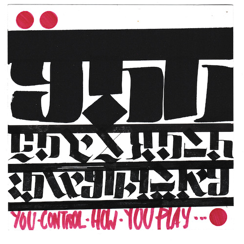
You Control How You Play
Oquendo’s first paintings using letter forms were of Puerto Rican poems and lullabies his mother had sung to him, or lines from popular songs of his mother’s era rather than his own. “I was combining the language I had lost with English. Now I’m thinking of writing my own poetry.”
“Although the decision to create my own alphabet was calculated, once I began, the alphabet evolved by itself. It stopped being a deliberate mingling of sources. At first I didn’t care whether the reader could understand my texts. I was preoccupied with balancing legibility and beauty. If I go too aesthetic, I go back to legible and vice versa. My alphabet, like ours, has 26 letters and translates visually each letter and the sound it represents.”
Oquendo’s peculiarly animated paintings of letters remind us that in ancient Egypt, every image, whether painted, sculpted or bas-relief, had to be accompanied by a text, otherwise it was deemed inert and lifeless. Every statue of a person bore his or her name, for a statue without inscription was one that served no purpose. Writing is a form of drawing which is universally considered potent, even magical. In the Bible, the story of Belshazzar’s feast tells of writing on the wall as portent of disaster: an invisible hand writes an inscription which only Daniel can read. It spells out that God has numbered Belshazzar’s days, and that he will lose his kingdom.
Oquendo’s texts are less ominous. They gaze into the past as well as the future, celebrating the artist’s own memories of an original language; his own cave of forgotten dreams, as well as those to come.
-
Stay on the Saddle Always
-

Remember This Always
-

See It. Observe It. Embrace It
♠
Lisa Zeiger was born in 1957 in Los Angeles. She graduated from Barnard College, and Columbia Law School, and earned a B.Dip in 19th and 20th century decorative arts from the University of Glasgow. Since 1990 she has been widely published in British and American art magazines, as well as in books on the artist Rosemarie Trockel. Lisa is the former Decorative Arts Editor of NEST Magazine; her blog on art, design, and literature is bookandroom.com.
The backstory is very motivating and the outcome of his artistry is beautiful! Would love to see the language evolve.
Love David’s work and how he has allowed his life to so intimately inform art. Can’t wait to see what he creates next!
I love how instead of wallowing in lack of supplies, he used what he had and made the best of his art. Very impressive.
It’s amazing how Dr. Oquendo included some form of Spanish in his artwork! It’s like he had some memory of it and made it into a masterpiece!