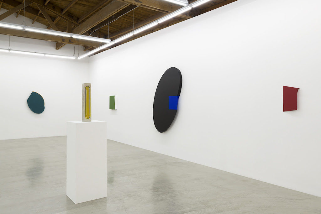
Tony DeLap: A Career Survey, 1963 – 2016, the bi-coastal double-venue exhibition at Parrasch Heijnen Gallery, Los Angeles, through December, and Franklin Parrasch Gallery, New York, through January, sampled the artist’s refined material treatments, quirky geometries and subversive edge-to-canvas relationships. DeLap’s category defying work intersected with a number of significant movements, including hard-edge abstraction, minimalism and finish fetish. His upcoming retrospective at the Laguna Art Museum (Tony DeLap: A Retrospective, February 25 – May 28, 2018) will exhibit 80 of his works and offer a comprehensive look at his five decades of art practice. In a recent studio visit, DeLap discussed his early career in the Bay Area, his subsequent move to Southern California, and his art.
CHRISTOPHER MICHNO: You were interested in a number of different disciplines—graphic design, architecture, design, painting and sculpture—and you once worked in architectural design.
TONY DELAP: I had a wide interest—not that I was that great at it all.
When I was in Claremont, I was doing my best to paint. Then I took an architecture class from Whitney Smith. We took field trips, and I was very interested in architectural design. We went to houses in the Case Study House Program and to the Frank Lloyd Wright houses in LA.

I was also interested in graphic design. Going to the Aspen Design Conferences helped me realize that the hierarchies—that painting was painting, architecture was architecture, and graphic design was graphic design—were not exactly what I had thought they were. And I liked aspects of all of them.
At Aspen I had an opportunity to meet the top people in their field, whether it was filmmaking or photography or painting or graphic design.
Then I started becoming more my own artist. That was really a turning point for me.
MICHNO: In his essay, “The Shadow on the Wall,” Bruce Guenther pointed to a shift between 1962 and 1963 when you began to really refine your work. There was a lot happening then.
DELAP: Yes, and also, irascible John Coplans came to San Francisco. I met him because at that time we both had a class at Arts and Crafts (CCA) in Oakland. John liked what I was doing, and I was very pleased by that. Artforum was in its beginning stages in San Francisco, and Phil Leider was the major writer for Artforum at that time. Coplans, who was just over from England was also writing for Artforum. He was the first hire for the UCI art department. He asked me if I would come down and help him start all of that.
Coplans was all over the place. Walter Hopps and Irving Blum and all of those LA people quickly became part of his group.
So here, right in this area, it was so conservative; it was just outrageous. But our house [Tony and Kathy DeLap] was like some underground thing. At the end of classes, everybody would come here.
One day I came in and there was someone cooking. I said, I’m sorry, you have to introduce yourself. I didn’t even know who it was. But John was bringing in New York artists. I became very good friends with John McLaughlin, who was down in Dana Point. For the most part, he wasn’t driving. So when we had a get-together, I often would go down to get him. For a couple of years we had those very close goings-on with the art world of Los Angeles and whoever Coplans was bringing in from New York. It was really quite terrific.
Coplans finally went east, and I think annoyed a lot of people because he had a tendency to come into a place and expend all of his own energies and then kind of write everyone off and go onto a new thing. He was sort of that type, always wanting something new. When we were in San Francisco, he left San Francisco because he thought it was such a provincial, backward place, as far as the arts were concerned, and he was in some ways quite right. And then he came down here. He didn’t like the idea that I was still in San Francisco.
I taught for one year in Davis, and when I finished that year, I could have stayed at Davis—it was interesting for me. Or I had the offer to come down here and help Coplans start UCI.
By that time many of the younger artists, artists my age, were here—much closer to my world than what I had in San Francisco. We had a great time for those first two years. And then John got involved with the Pasadena Museum. Walter Hopps, Coplans, Irving Blum and a few others, they ran around together.
And then of course eventually, I think, Coplans began to write off Los Angeles a little bit because next, it was New York.
MICHNO: And John McCracken was your studio assistant?
DELAP: John McCracken was my student at Oakland. When I first started teaching at Arts and Crafts, he was in one of my painting classes. We became friends, and he became my teaching assistant. For years he was my studio assistant. When Kathy and I came down here, he was without work. So I said, come on down. I got a studio in Costa Mesa and told him, make yourself at home. So the two of us worked in that space. He did his first plank there.
When Coplans and I talked about who we would get to teach at UCI, we thought we could certainly get McCracken because he was right there and didn’t have a job. So the department grew, and we brought others in. It was quite terrific.
MICHNO: Some of your early work looked like Joseph Cornell boxes.
DELAP: Absolutely. I didn’t know Joseph Cornell until I came to Los Angeles, and Irving Blum had a couple Cornell pieces, which I certainly very much liked. Those were the first I had seen. I was a kind of junk collector/painter. I used to go to the junk yards around San Francisco, which I quite enjoyed, find things and include them in collages in a very abstract-expressionist way. I think a lot of that came from seeing the art magazines from New York.
There were some real collage artists in those days. So I was quite involved in that, and I was doing OK with the work locally and having San Francisco museum shows. But then, one day—and it hit me rather quick—I went from that to a whole different approach. I put together a small hard-edge piece, with circles stepped down and a hole in the center. But it was two sided. I glassed that into a box, and it said “Mona” on one side and “Lisa” on the other. And then I did some paintings that were two sided. I made a similarly stepped-down painting. I took it off the wall and said, what’s going to happen if I put a back on this that’s the same as the front? It became a painting that you could walk around in real space.

So I started doing those–mainly the boxes–first, with trivial four letter words: “Time Bomb,” and things of that sort.
I got the graphic characters from the art store. I was good at making precise imagery with simple tools because I had grown up making things. And I enjoyed it. It was nice to get back to materials.
That became a very successful avenue for me. There were various museum people from the East Coast around. I somewhat quickly got a reputation for what I was doing and was in some of the major shows on the East Coast.
I was very pleased with that. I remember one phone call from a show they were doing in Oakland. They asked if they could borrow one of these pieces of sculpture. I said, I’m not a sculptor. The guy said, I don’t give a hell what you call yourself, can we borrow one of those things?
It amused me. I went around for a few days and said, gee, I’m a sculptor. But then I thought, well, I’m not a sculptor; I’m a guy that makes two-sided paintings.
About that time, we came down here and I continued. But things began to change a bit in the work. I was going into different modes of expression, into what I call the twisted pieces and freestanding sculpture. Probably from my involvement in school with architecture, I always wanted to work on a larger scale. I had a number of opportunities to work out doors at an architectural scale. I enjoyed working with that kind of space, something you could move around or walk under, as compared to working in the studio. I think my work, even the paintings, have always had a physicality that certainly was, from my thinking, between painting and sculpture. That kind of hybrid work is what I was interested in.
MICHNO: The stretcher/support relationship to the canvas is important in much of your work. Is the curvature of the edge, which changes radius, all one piece of wood?

DELAP: Yes, one piece of wood, and it starts at ninety-degrees and then twists in toward the wall. That twist is hyperbolic. So it’s very much like the endless column. For example, you take a piece of paper and twist it and bring it around again in a childlike image—a figure 8 or whatever the case may be.
When I developed the cutback edge, for me it was very interesting. I made a–it could have been just a square, and I made it with 90 degree sides. I stretched the canvas and put it on the wall, and I looked at it one day and just hated it. I thought, this is the dumbest thing to bother doing.
And then I went in one day with the same piece and took the canvas off, and that was when I made that hyperbolic edge, starting at 90 degrees, and having it cut back. And in that, there is a twist, which is an architectural form. Correctly made, architecturally, that twisted form is made out of straight lines. You can take straight timber and make a hyperbolic shape. So with the tools I have in the shop, I would cut all that. I would take a 4 x 4, just as an example, and I would start at one end and just start taking it off. When you put a straight edge on that, where light doesn’t come through, you have a hyperbolic curve. There are a number of buildings around the city—Eric Moss has a building or two like that.
MICHNO: The pieces you made with text–that got paired away pretty early.
DELAP: Oh, yes, it did. That was kind of a whim. I don’t know how many of those I did—probably a dozen. That was also quite early. When I came to Southern California, I had some of the first ones fabricated in aluminum.
MICHNO: Were those influenced by your interest in graphic design?
DELAP: Yes, and at the time I wondered, this is silly, isn’t it? But that’s where Coplans was good for me because he often protected me from my stupidity.
MICHNO: How?
DELAP: I would do something, and he would tell me, you’re really onto something here. Because sometimes you wonder just where you’re going.
MICHNO: Your new paintings are a combination of hard edge abstraction and shaped canvases.

DELAP: I have been looking for a more traditional means of ending up with something. I’ve been getting medium-sized pieces of aluminum cut into a square—eighth inch aluminum—and I’ll take that and stretch linen around it. After I’ve done that, I’ll paint.
MICHNO: I was looking at a photograph of the floating lady at what was then the Newport Harbor Museum. How did you pull that off?
DELAP: I really like this story. I hired a crane. Noisy as could be. He could only travel at certain times of day.
We had hired Farrah Fawcett’s double as the floating lady, and I made a cradle. She was paid by how high off the ground she was going. At twenty feet, the theory was, if she fell, maybe the worst that would happen would be a broken arm. But then when it got up to forty feet, the cost really went up. Anyway, it worked out fine.
Night time came. She got up to about thirty feet off the ground. There was a high intensity light on her. It looked terrific. What I enjoyed out of the whole thing was that I had Dai Vernon, the great magician, my hero actually, in the magic world, come down from uptown. He was the guru at The Magic Castle.
I was always so honored to have him as a friend. Several weeks later I was at The Magic Castle, and Vernon was holding court with four or five magicians. I walked over and he said, Tony, come and sit down. So I sat down. After a little while, he said, oh by the way, I have to tell you guys, I went down to Newport a couple of weeks ago, and my friend here, Tony DeLap, he levitated this woman out over the ocean. One of the magicians said, my god, at that distance, how in the hell did he do that? And Vernon said, I haven’t the slightest idea. And all these guys were sitting there aghast. It was really quite funny. He was the best—really a great guy.
MICHNO: Barbara Rose and Mike McGee wrote about your work related to illusionism. Christopher Heijnen said that he thought people made a little too much of that, that it was too easy of a connection.
DELAP: The magic bit. I was very sensitive to that in the early years in particular. It’s not that I didn’t like it, but I thought that very often the layman would rather hear those stories than talk about art.

MICHNO: It’s interesting that Levitated Lady at the Orange County Museum and the piece with the beam balanced on two sheets of glass in the show at Parrasch Heijnen both allude to sleight of hand.
DELAP: Yes, I guess they do. The beam, which is mentioned in the catalog for the Laguna Art Museum retrospective, is something I was working with in those days. I liked how it divided a space and pseudo-floated above. I did that at John Berggruen’s at San Francisco. There was the floating beam that didn’t touch the wall, and right at the end, a painting of mine, and that was pretty much the show. A middle aged couple came into the gallery, looked all around, and one said to the other, we’ll come back when the show is up. That was about the way it was received.
MICHNO: One of the things I thought was interesting about the beam at Parrasch Heijnen is that you could see the seams. From a distance, you might think it’s a solid beam, but when you look at it closely you realize that it’s birch plywood. So it’s hollow.
DELAP: In the old days I never covered the ends. I left them open. But the scale was about the same on the early beams. The beam at Christopher Heijnen’s was a beautiful beam, I think. I never did something exactly like that, but I did some with right angle pieces of glass and a beam at the top. There was one I liked quite a lot, with a glass sheet on top of a step ladder. And then, of course, there were the ones that didn’t touch the wall. So I did play with the beam in a fair number of installations.
MICHNO: With your shaped canvases, were you intentionally engaging in a discussion of the painting as an object?
DELAP: I think it was something I was attracted to, and I think a lot about those kinds of things. I always did, but maybe even more now. I think I always felt the most comfortable when I had something on paper, with drawing and working out something that would eventually be dimensional. And I was always, particularly in the early years, very comfortable with working in a craftsman-like way with materials. I enjoyed it. In my quite early years, when I should have been doing school work, I was much happier making something, whether it was carving a boat, or something else. I went through a period where I made model hot dog stands—it was so weird. I wish I still had one or two of them today. I made outdoor hotdog stands with little seats, and then I’d make little signs: Hot dogs for sale.
The first water colors I made, I couldn’t wait to put in the telephone poles. I always felt that if I put in a telephone pole, it made it a more modern painting. It indicated something to me. So it’s funny about those kinds of things. For one artist, it’s one thing; for another artist, it’s something else.
~
Christopher Michno is a Los Angeles area art writer and the Associate Editor of Artillery. Mr. Michno’s work has appeared in KCET’s Artbound, the LA Weekly, ICON, and numerous other publications. He is also an editor for DoppelHouse Press, an LA based publisher that specializes in art, architecture and the stories of émigrés.
[paypal_donation_button]